Brand Conceptualisation
Overview
In order for this project to be an engaging enterprise, Tale Trek must be able to visually convey to the target audience through its brand identity what their core values are. Fundamentally, Tale Trek is a nature reserve located in the heart of the Peak District that combines both traditional story telling with immersive technology in order to create a compelling experience for the visitor. I’ve chosen to do this in order to fit alongside the direction technology has been moving and to accommodate how the world is changing.
Project Name
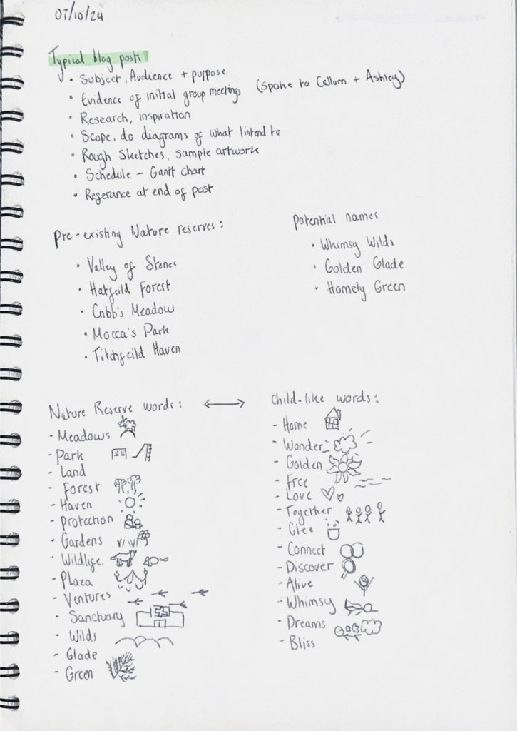
I’ve chosen the name ‘Tale Trek’ as it both encapsulates two different meanings of the word whilst being spelt differently. One of them referring to the word ‘Tale’ meaning a “fictitious or true narrative or story, especially one that is imaginatively recounted” which is exactly how I want to portray the narrative in the nature reserve. I preferred the word Tale over other synonymous words such as ‘story’ or ‘narrative’ as it had more connotations to older stories that were traditionally called fairy tales; adding a sense of whimsy and joy to the reserve. It also makes the story seem more like a quest that must be completed which is in essence what the plot is based off of. Of course, the word ‘tale’ also sounding the same as ‘tail’ worked perfectly for this project with a lot of the brand identity being focused on a fox with one of their most prominent features being their tale.
The word ‘trek’ naturally came after the word ‘tale’ due to how the nature reserve as a whole is a long walk. Both words also begin with T which allows for a nice sounding name with alliteration that also gives it a more child-like feel to it as it’s targeted towards younger children.
Colour Palate
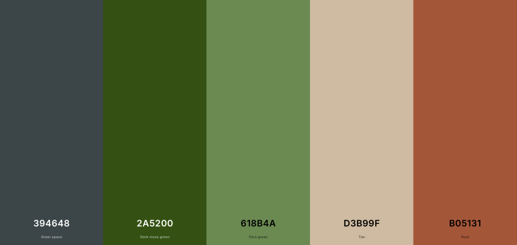
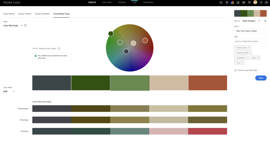
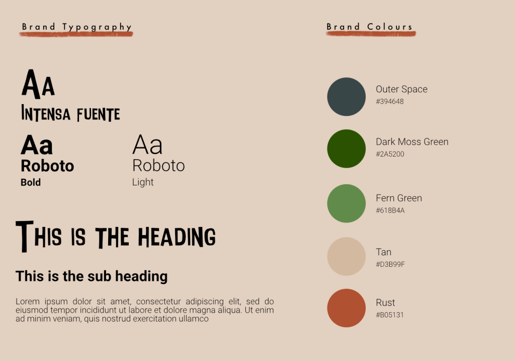
Tale Trek is a brand that is immersed within nature and the countryside, so naturally I’ve chosen colours that emulate those that are found in the wild. I also wanted them to be soft, muted hues as to not be overstimulating for children as this reserve is a place for peace and relaxation. Both Outer space and Dark moss green are colours that represent the depth within the trail e.g the dark woods and flowing rivers which I can also use as the text and background colours within my brand identity as they allow for good legibility when read against lighter colours. The lighter colours: Fern green, Tan and Rust complement the darker ones nicely and represent the flowers and animals seen along the reserve. Rust, especially, will be used frequently as that’s the main colour of the central figure ‘Finn the fox’.
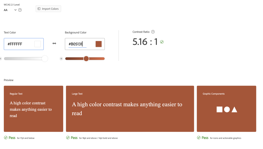
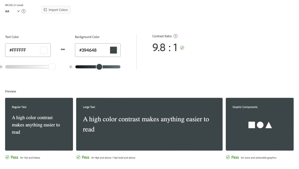
I’ve checked the contrast levels of the colour palate to make sure no conflicts were found amongst the colours and I could continue to use them throughout the brand identity. This is important as all text must be legible, especially considering the main demographic and how smaller, less bold text will be harder for younger ones to read.
Logo
Logo planning took longer than I had initially accounted for due to the change in name and design. To begin with I wanted to call brand ‘Golden Glades’ to gave a sense of warmth and cheerfulness. However after prototyping a logo for this name choice I didn’t like how yellow toned the overall brand identity would become. It also didn’t represent the direction of storytelling and usage of animal mascots that I wanted this project to be about.
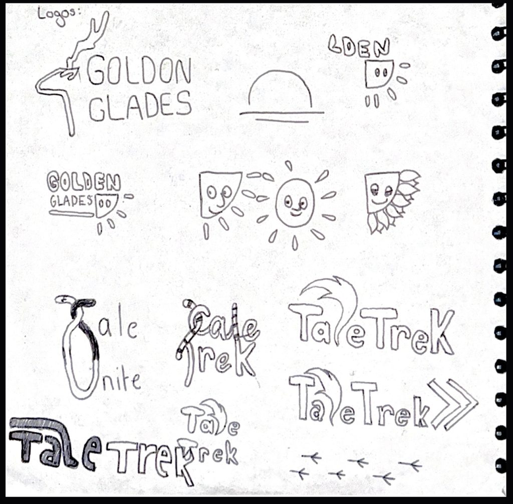
Once I’d changed my mind to Tale Trek the process of logo ideation came fairly quickly as I knew I wanted to incorporate imagery of a tale somehow into the logo to make it obvious that there would be two separate meanings to the word. Because I designed the tale to be wrapped around the word I thought it’d be fun to mirror this in the lettering by resizing and altering them in order to create an almost puzzle-like logo. This reflects the brands core values as the whole storyline is trying to figure out the answer to their problem.
The inherent design of the logo also made it easy to animate which I’ve done here with the tail wagging back and forth. This is a nod to the 3D animation where the main characters tail is always wagging.
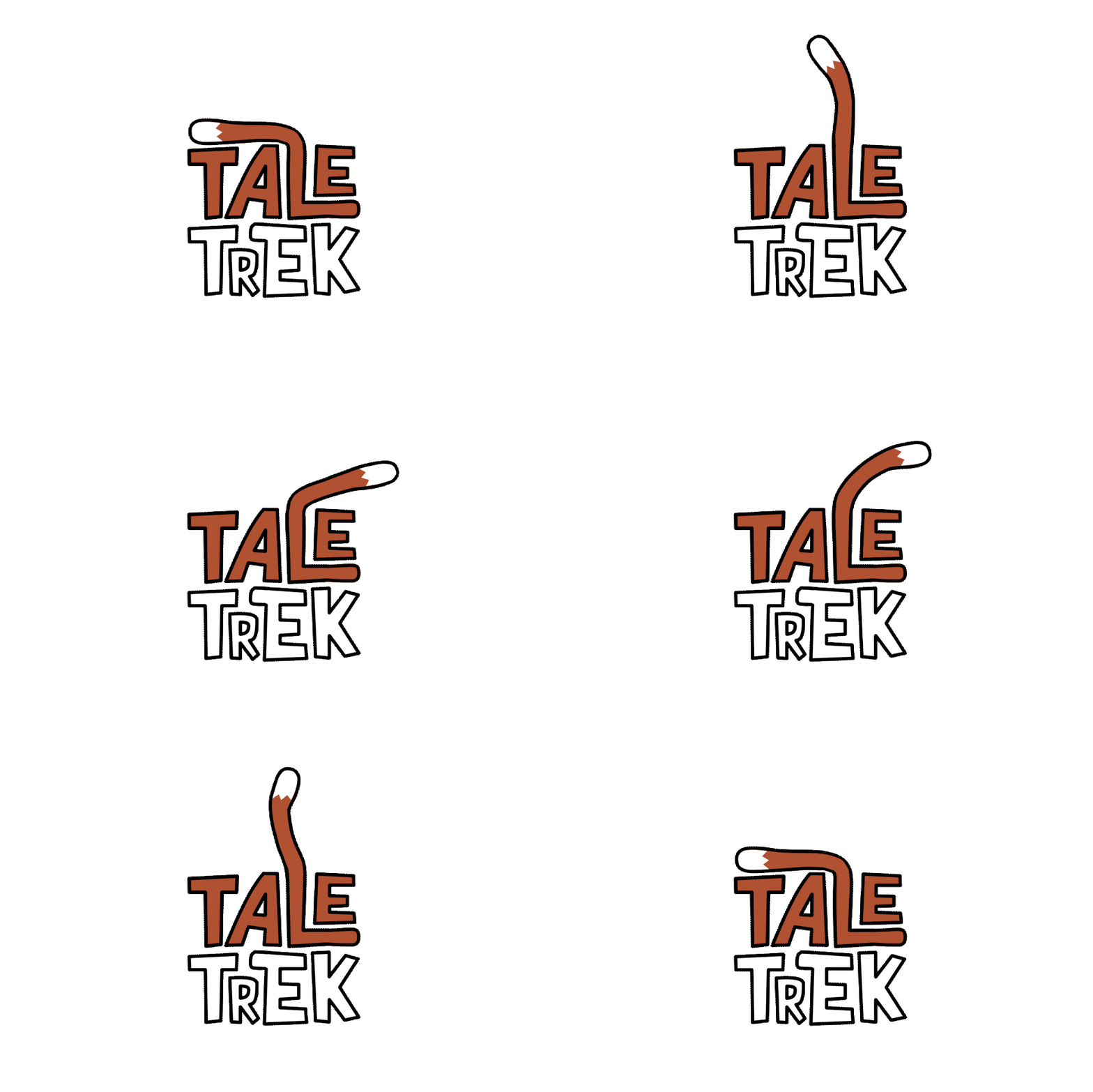
I designed this logo in 4 different colour ways using the brands colour palate in order to use them interchangeably throughout the marketing. I’ve done this as sometimes the logo doesn’t stick out enough depending on what background is beneath it which is important to be able to see to improve brand recognisability.


Typography
For the brands typography I wanted to keep it very simple with only 2 main fonts being used. I’ve done this again to enhance brand recognition and to also not muddy up any of my designs with too much different lettering going on at once. For my main font I’ve chosen ‘Intense Fuente’ which has a bold, in your face design style which is also characterised by it being always capitalised. The reserve is supposed to be a bold and exciting place to visit where children can surpass the limits of exploration which I wanted to mirror within the font. The thick lines in the typography also resembles wooden sticks with the uneven edges and constant change of line width which is appropriate considering the natural themes running throughout.
For my second font that I have used for the subheading and body text throughout the project I have chosen Roboto bold and light. Roboto is a much more simple font family which I think paired well with the bold look of Intense Fuente.
Character Creation
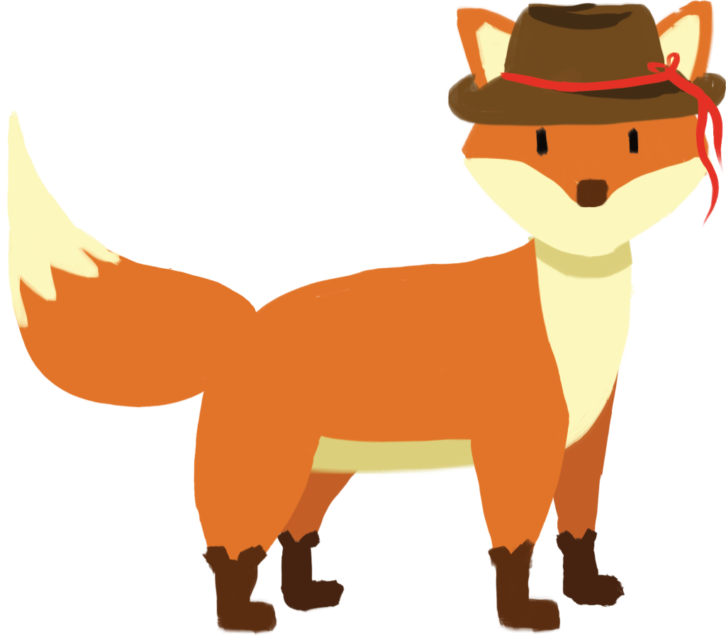
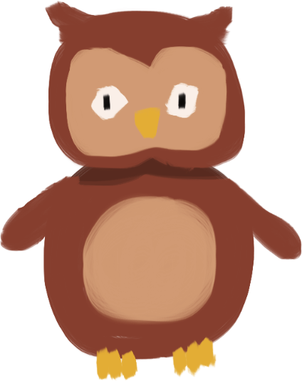
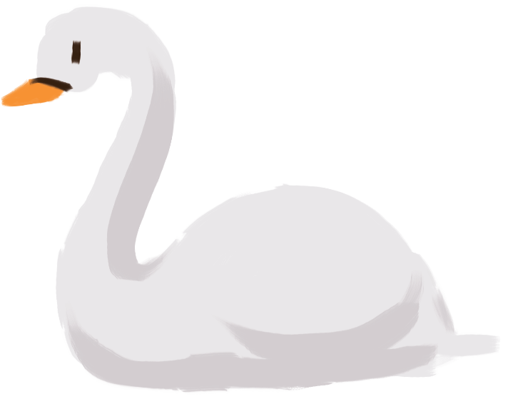
Throughout the history of marketing towards children there is one common theme used to attract that demographic and that is characters that can be attributed to the brands public perception. One of the primary reasons animal characters are so beloved in children’s literature is their psychological appeal, they are often seen as non-threatening due to their design, meaning children can develop strong emotional connections to them even if they aren’t real. For this reason I wanted the storyline to feature a set of classic characters based off of animals most commonly found in a nature reserve, that way I can turn them into company mascots and utilise them throughout the nature reserves campaign.
Here I’ve sketched out various animals found in local areas using a cartoonish art style used by famous children’s illustrators. By using a similar style I hoped to invoke feelings of nostalgia in the children who were maybe read these books when they were even younger as well as the parents who actually read them.
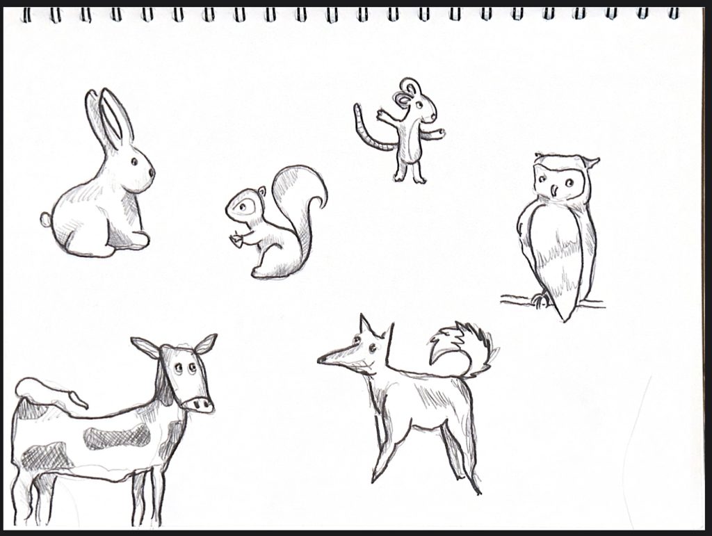
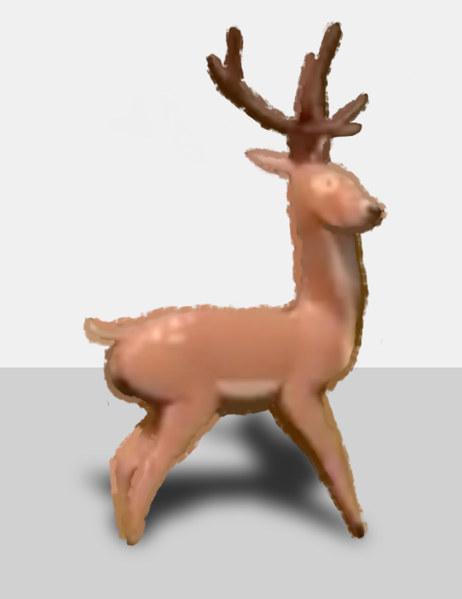
I landed on 4 different animals that were to be used in the main storyline and made 3D and 2D models of them. I kept the art style consistent throughout all the animals as well as the throughout the different dimensions. This way they can be recognisable no matter if they’re seen on 2D publications or within the 3D animations.
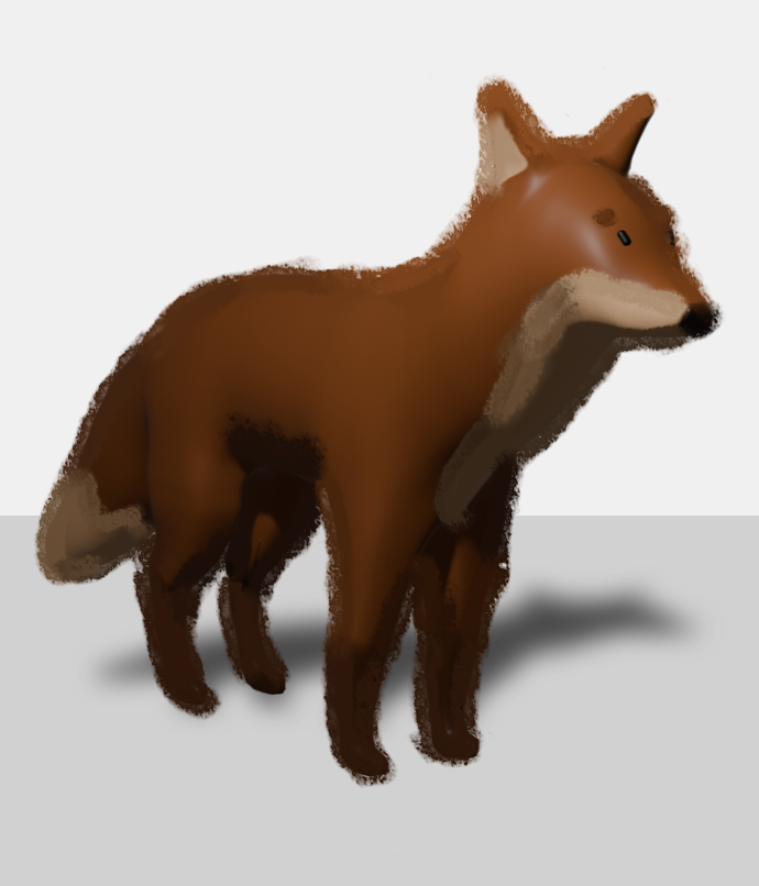
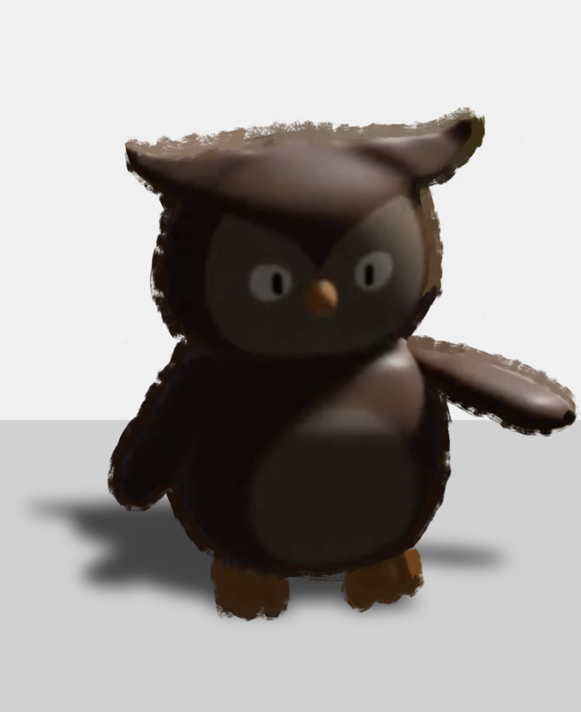
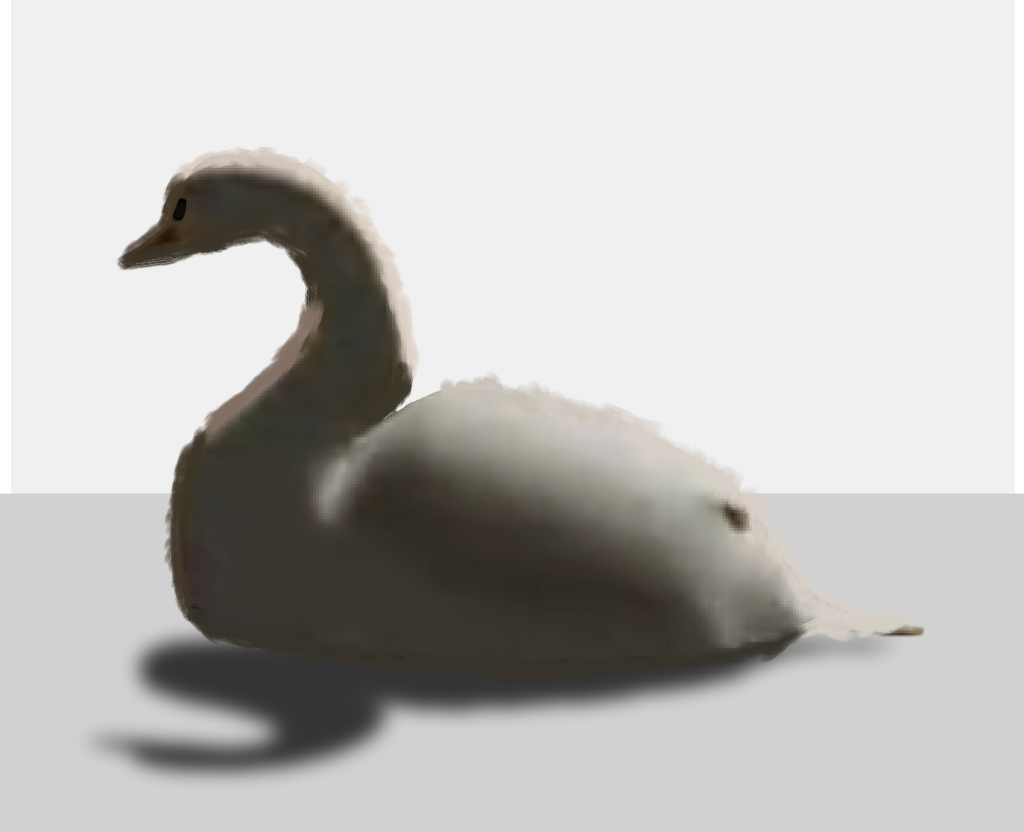
Character 3D Designs
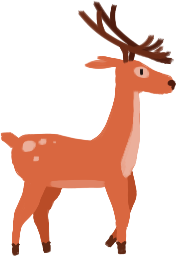
Character 2D Designs