Brand Guide
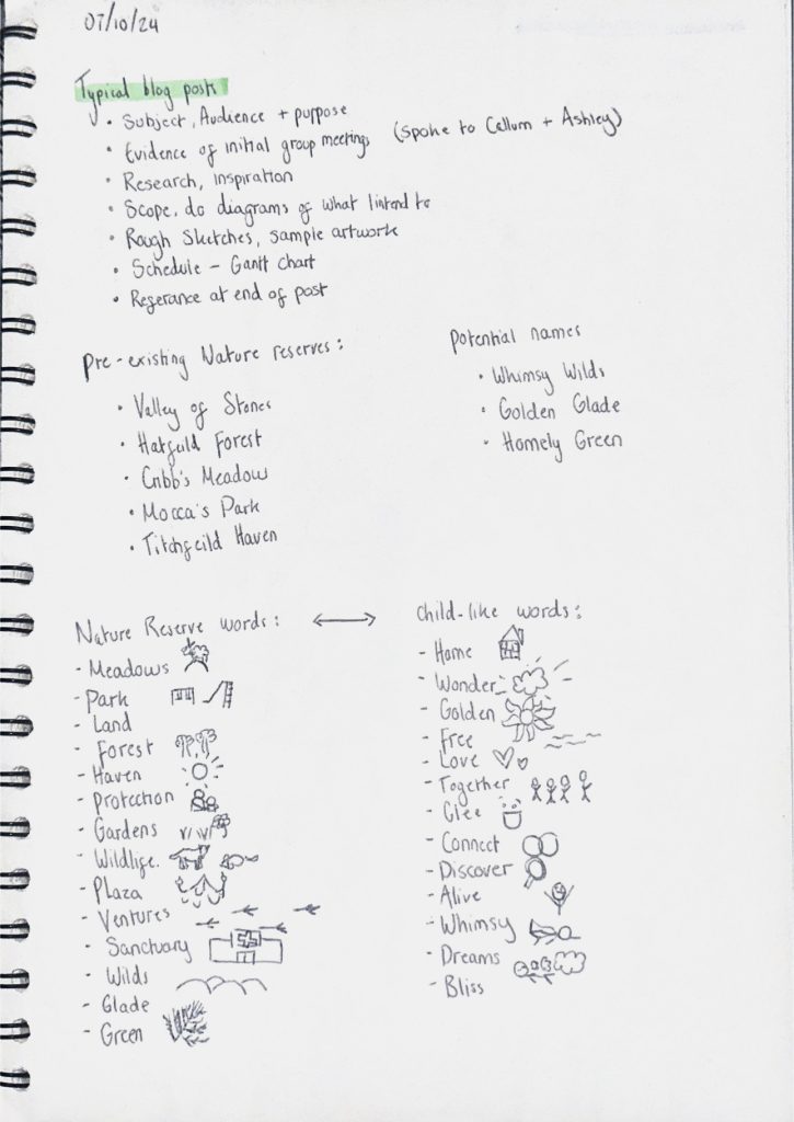
To begin with I had too many ideas for this project and it all jumbled together and created very daunting tasks. I wanted the main focus of the reserve to be an gamified social media app where the visitors could scan what they found in return for points/prizes, however this didn’t mesh well with the fact I wanted to incorporate a lot of animation along with a narrative. During this time I had named the project ‘Golden Glades’ as the focus was more on the landscape but I didn’t like how broad and vague it sounded. After deciding I wanted the narrative to play a bigger part I renamed it to ‘Tale Trek’ with the word ‘Tale’ being interchangeable with ‘Tail’ to hint towards how it’s still animal centred.
On the right I brainstormed words that could be used together to get the right name for the project. I was often drawn to names that used alliteration as it made the brand seem more child-like and poetic (with alliteration and rhymes being heavily used within children’s books). On the left I started to think about the logo, which I found came much easier after changing the name to ‘Tale Trek’ as it seemed to have way more possibilities of being creative within the word.
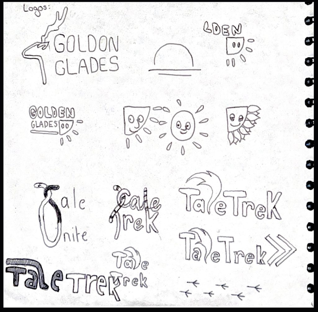
I landed on a logo that uses a very bold, blocky font in order for it to be well read by children but also get across that it’s bold and exciting. I manipulated a few of the letters in the word in order for it to fit together like puzzle pieces and also leave less blank spaces out to make it more visually appealing. I also think that the way some of the letters are higher up and some are lower down is reminiscient of footpaths trekking through mud, albeit not very obvious to the viewer.
In order for it to be obvious that I wanted the word ‘Tale’ to also be interpreted as ‘Tail’ I had to decide on a way I could incorporate a tail without it looking too tacky and obvious to what I was trying to achieve. I, of course, had to elongate the L into a tail as that letter makes most sense into being transformed. Especially with the fox-esque colouring at the end I believe it’s quite obvious what it’s meant to be. This design also leaves potential animation designs open with the tail waving between the letters when the user loads up the virtual tour.
Digitised Project Logo.
The blockiness of the font plus the fact all the letters are squished together means that the words are easily stackable which would potentially make for a nice emblem on the website or merchandise etc.
Second version of logo.
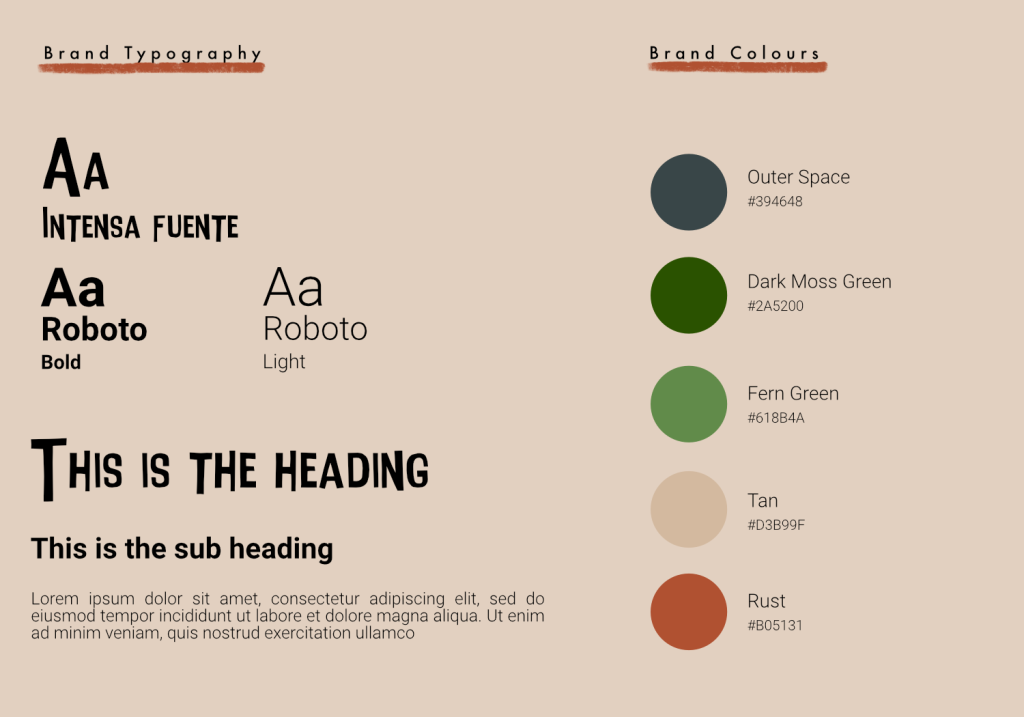
For the colour palate I wanted to stick to earthy, warm tones as those colours are what’s most commonly found in nature. I used the rust colour in the logo as the tail was supposed to be that of a fox which I believe the burnt orange-y colour further emphasises. I will use white text on top of the darker Blue, green and orange shades and then use black text on top of the lighter tan and fern green colours to ensure that the contrast always meets the set requirements.
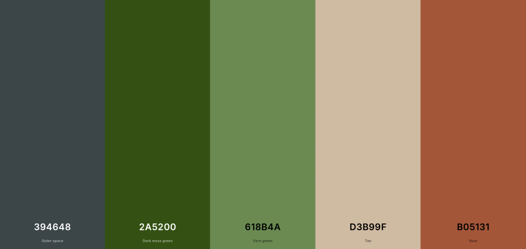
Project Colour Palate.
Here I’ve used Adobe Colour to check my colour palate and make sure it meets the standardised requirements needed for brand identity. I first checked that my colour palate would be colour blind safe as it’s important to recognise all audiences that could potentially be viewing my work. Adobe Colour has then said there have been no conflicts found. It also allows you to see how the colours would be perceived depending on what type of colour blindness you have.
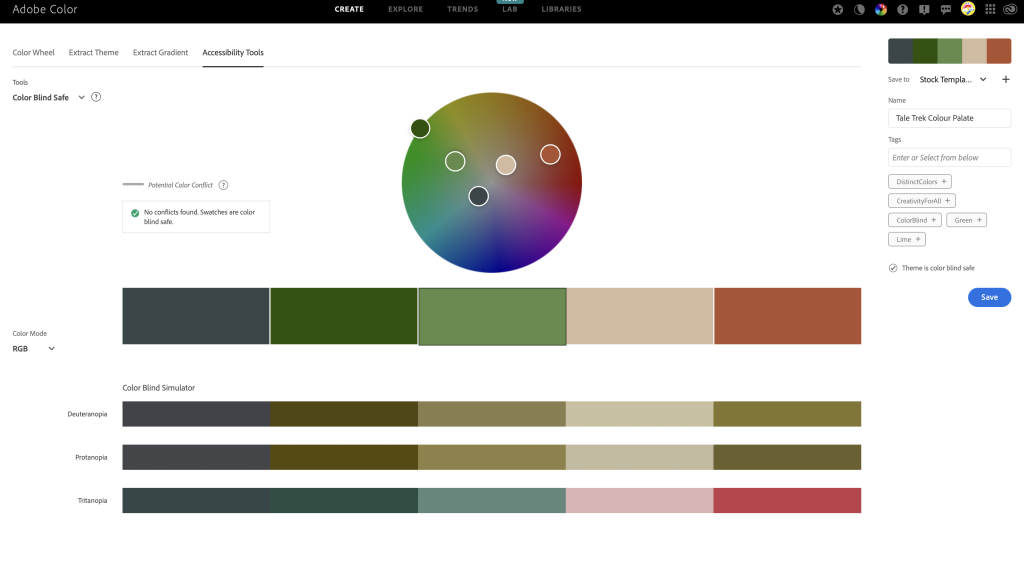
Using Adobe Colour to see if the colour palate is colour blind safe.
Adobe Colour also allows you to check the contrast levels to make sure the text would be readable. I first inputted my orange colour which I will definitely use as a background somewhere along my project and it meets both AA and AAA demands. The same goes for the dark blue shade in my palate.
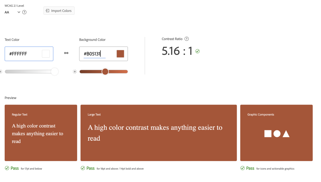
Using Adobe Colour to see if the contrast levels are high enough in the colour palate.
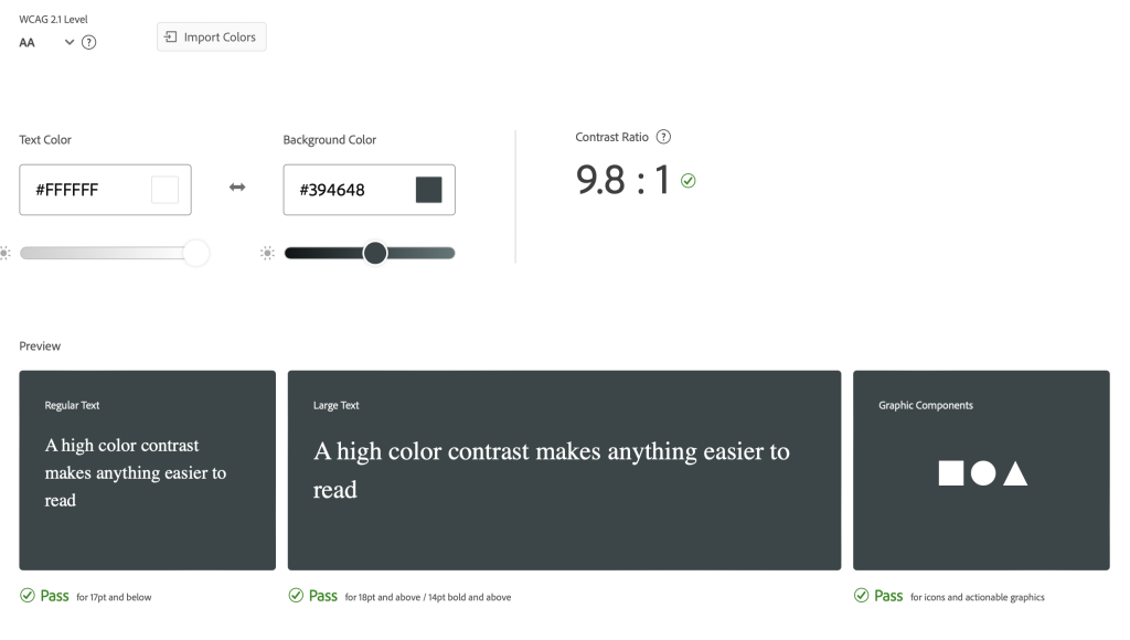
Using Adobe Colour to see if the contrast levels are high enough in the colour palate.
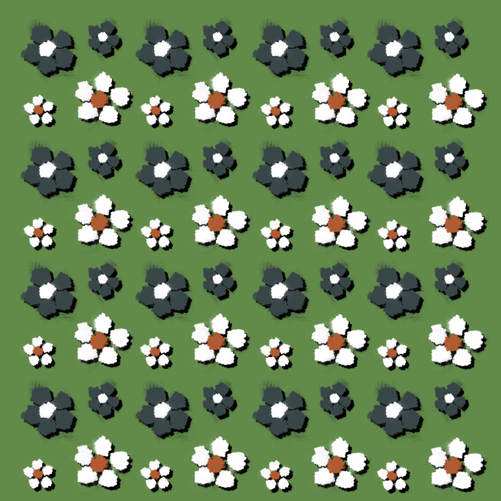
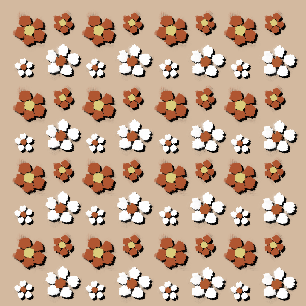
Here I’ve designed a simple brand pattern in two differing colour ways. I’ve used a simple flower design to mimic the look of a meadow.
I then moved onto the typographic standards for my project. I will use a bold, stick-like font similar to my logo font for all the headings in order for it to clearly stand out amongst other text. It will always have a larger point size to that of any text to further its readability. For the body copy I will use ‘Roboto’ as I think the simple sans-serif font compliments the loud, uneven font of the header.
Tale Trek’s Typographical Standards
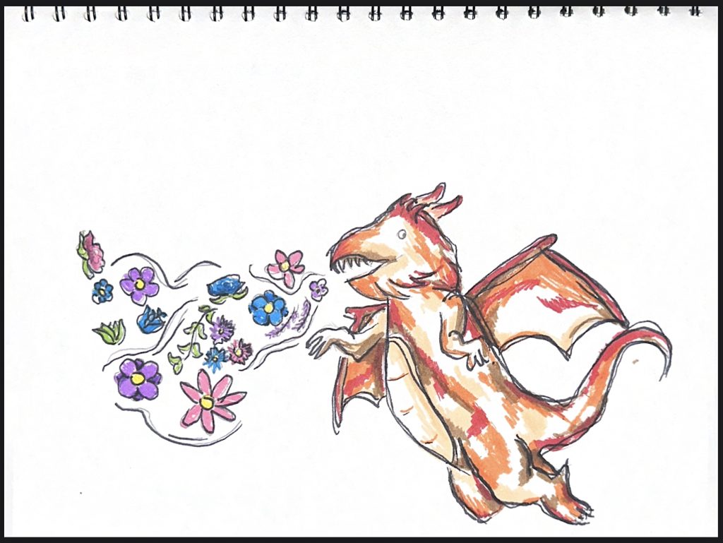
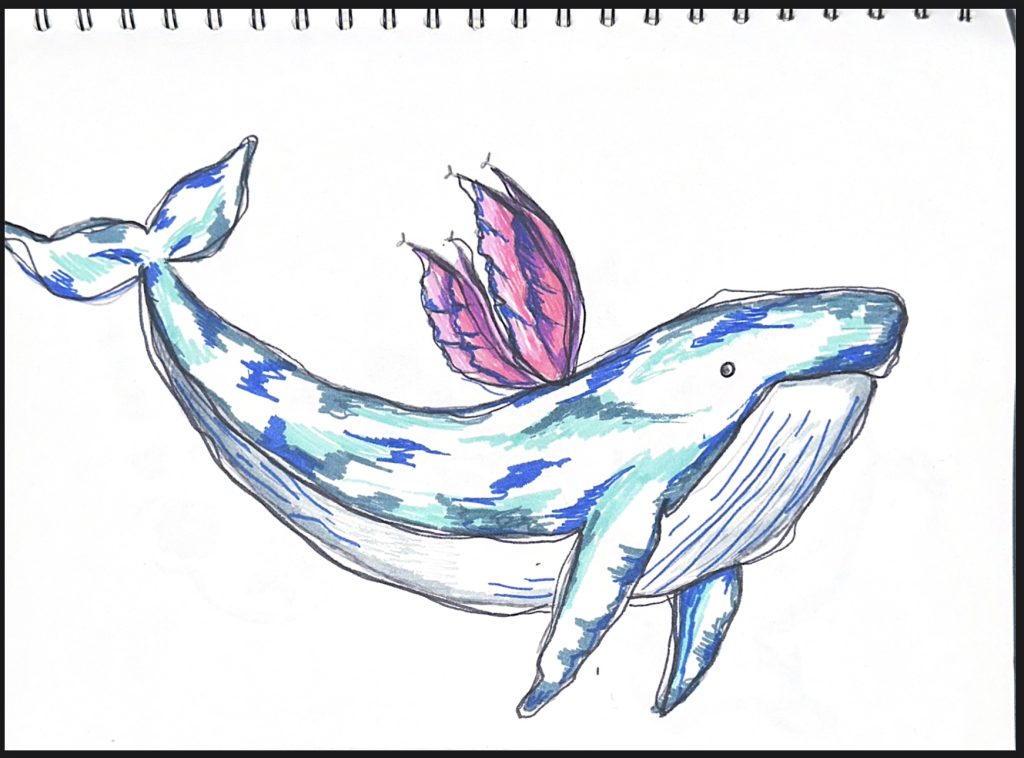
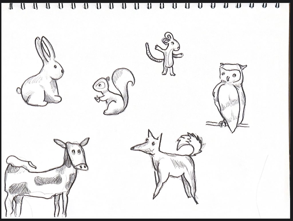
As my project will be heavily sketching and art based I’ve created a few rough drafts for how the animal mascots may appear in the final version. I’ve taken into consideration of my artist research and been inspired by their art-styles to design my own characters. These drawings would also translate to 3D models well if I wished them to.
Sketched out animal characters.
I then sketched some more far-fetched animal designs that I most likely won’t use in my project, however I wanted more practice utilising the children’s illustrators art styles and seeing how they would look in colour.